
Let's talk

Radiant

I designed and built the marketing website from scratch for Radiant, a desktop-only meeting notetaker for Mac that became Supernormal's 2nd brand.

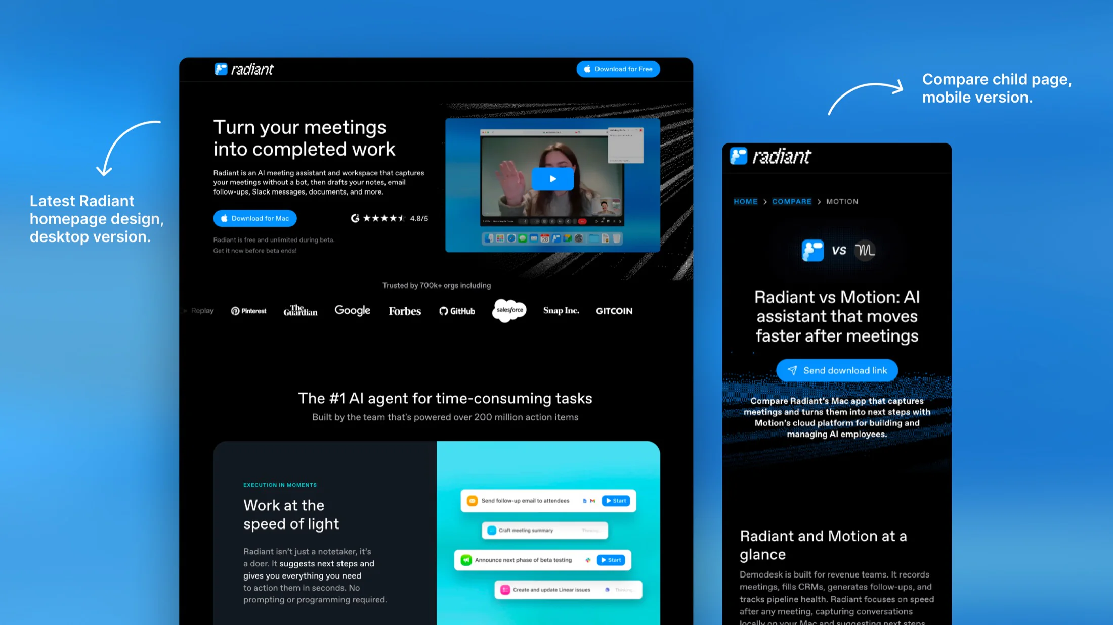
The latest Radiant homepage design on desktop next to the mobile version of a 'Radiant vs Motion' compare child page.

Tools I used for this project

FramerWebflowStatsigNotionZapierIntercomFigmaMetaCanvaCapCutFramerWebflowStatsigNotionZapierIntercomFigmaMetaCanvaCapCutFramerWebflowStatsigNotionZapierIntercomFigmaMetaCanvaCapCut

Role

Visual and web designer

Timeline

2025 to Now

Team

MarketingEngLeadershipAnalytics

Overview

Launched in September 2025, Radiant was a bot-free meeting notetaker app for Mac with integrations and automated action items.

Radiant evolved from Supernormal's web app and launched on Framer while the original Webflow site stayed live.

My main work included CMS pages, A/B test landing pages, a mobile email-link journey, and static ads for paid campaigns.

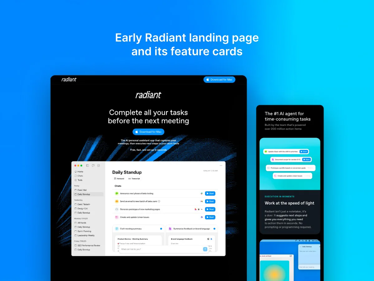
Radiant's early Framer landing page: a dark hero reading 'Complete all your tasks before the next meeting' next to a Daily Standup app mockup, with its 'AI agent for time-consuming tasks' and 'Work at the speed of light' feature cards alongside it.

The notetaker over time

Radiant sat between Supernormal's original notetaker meeting bot and today's desktop meeting capture app for AI Agents.

Scroll further for Radiant's full story, or visit the Supernormal case study for the wider product story.

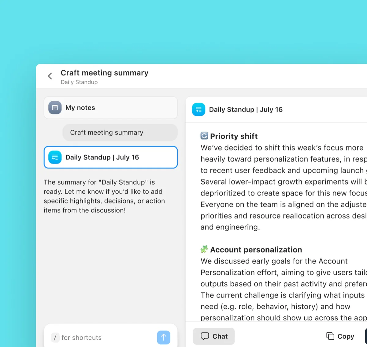
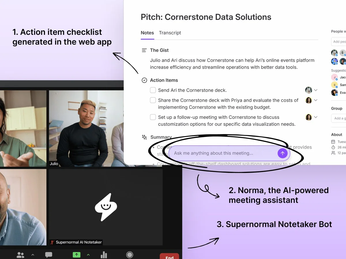
The original Supernormal web app: an editable meeting summary with checklist action items, Norma the in-app AI assistant, and the Supernormal Notetaker Bot visible in a Zoom call.

Supernormal began as a web app with a visible meeting bot, AI summaries, and checklist action items.

2 products, 2 websites

Radiant became Supernormal's 2nd product, launching on its own website while Supernormal kept its original site for existing users.

Supernormal on Webflow

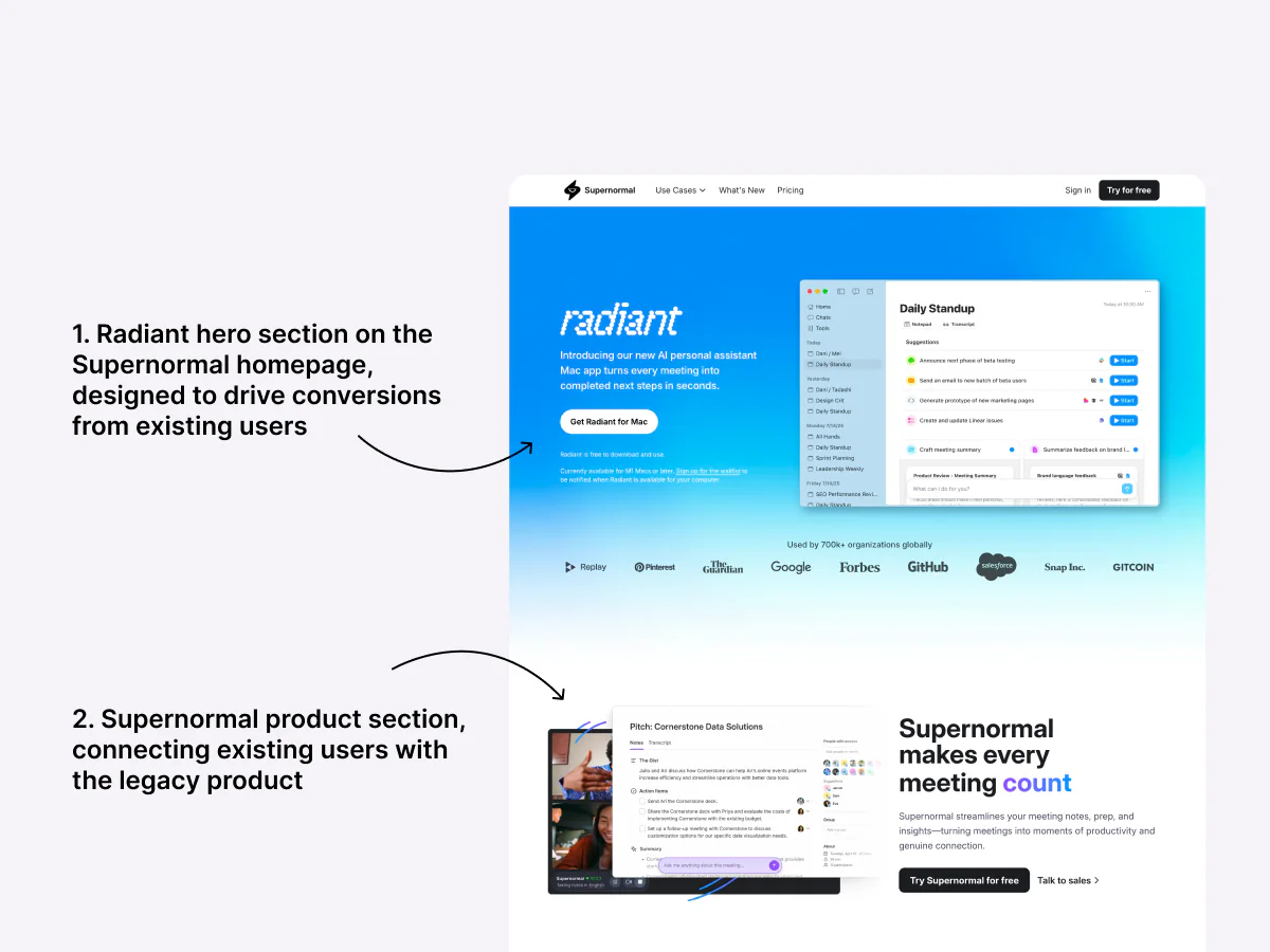
The optimized Webflow website stayed live for original users, so we added a Radiant hero section.

The Supernormal Webflow homepage annotated in 2 parts: the Radiant hero section designed to drive conversions from existing users, and the Supernormal product section below it connecting those users with the legacy product.

Radiant on Framer

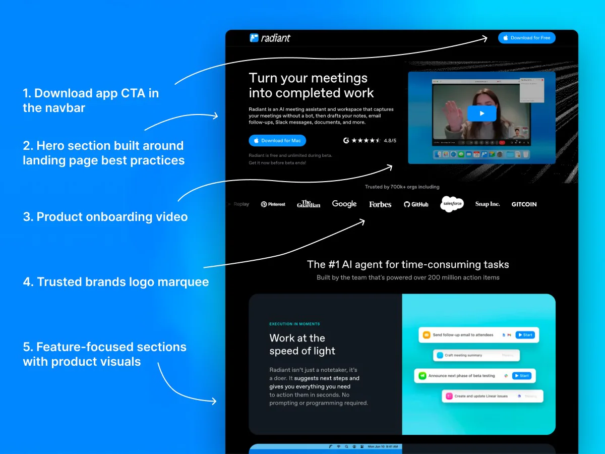
Framer was our 1st choice for Radiant: quick to learn, multiple CMS page types, faster publishing.

The Radiant homepage with callouts for its download CTA in the navbar, the hero section, the product onboarding video, the trusted-brands logo marquee, and the feature-focused sections below.

From pages to a system

I built Radiant's pages using Supernormal's existing website model as a starting point.

I then significantly improved the structure and design in collaboration with marketing and leadership.

~0

Pages built

across the Radiant marketing site.

0

CMS collections

built for reusable templates and quick-to-publish content.

0

A/B test pages

running for different campaign messages while ads were active.

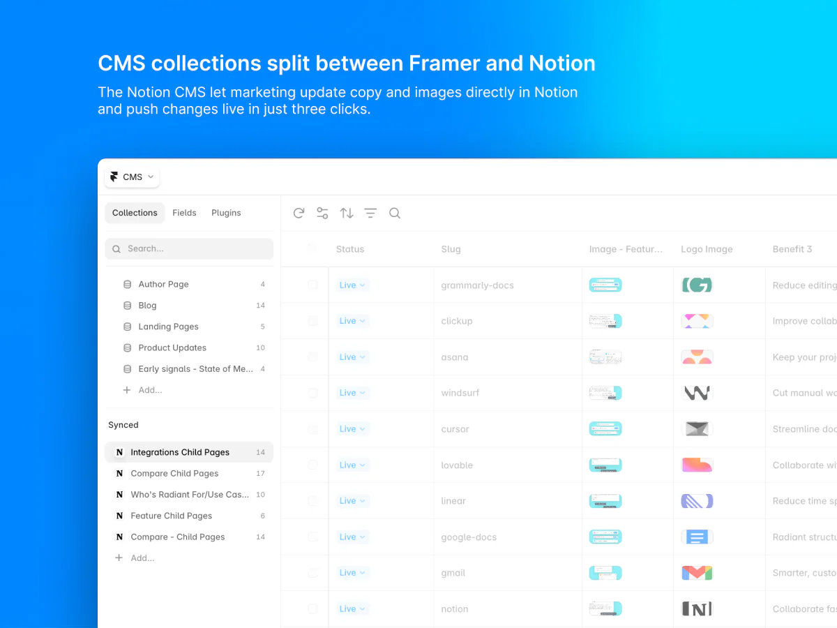
Radiant used both Framer CMS collections and Notion tables. Marketing could edit content in bulk in Notion and prepare it quickly for CMS templates.

Framer's CMS required more technical setup.

A Notion CMS collections view, showing synced Notion tables like Integrations Child Pages and Compare Child Pages alongside the Framer CMS collections.

Download mobile flow

Desktop visitors could download the Mac app directly. Mobile visitors coming from paid ads needed a way to save it for later.

Download button on the web

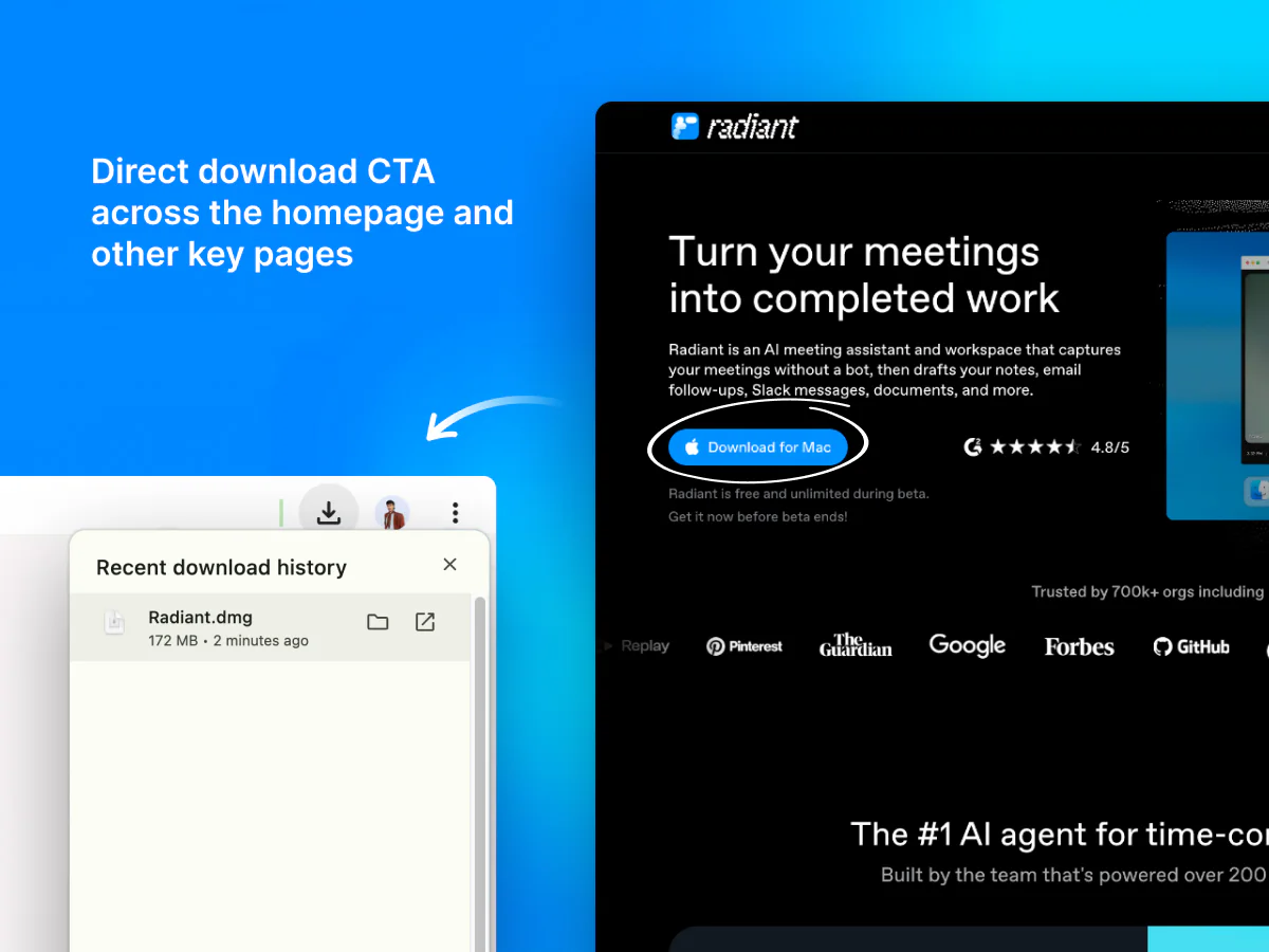
Desktop visitors could download the Mac app in 1 click from the hero, navbar, and Radiant pages.

The Radiant homepage with its 'Download for Mac' CTA circled, next to a browser download-history popup showing Radiant.dmg just downloaded.

Download link on mobile

The desktop app couldn't be installed from a phone, so an email form sent a Mac install link.

The mobile download journey: a 'Get Mac App' CTA opens a form for an email, which sends a download link that opens back on desktop.

Follow the mobile email journey below:

  1. Any visitor who landed on the mobile homepage saw a Send download link button in place of a direct download button.

  2. Visitors tapped Send download link and entered their email. Zapier passed the request to Intercom, while Statsig tracked clicks on the button.

  3. The original email process could take up to 1 hour to send the download email. We added a dedicated email sender in the middle for instant delivery.

    Intercom sent visitors the Mac download instructions, then followed up with feature tips and reminders.

  4. Visitors opened the emailed link on a Mac to visit Radiant's homepage, download the app, and sign up.

While Radiant was an active product, the Send download link button saw an average of ~1,190 clicks per month, suggesting a promising solution for converting mobile visitors.

A/B testing

Eventually, we published 3 A/B test landing pages, each with different features, copy, onboarding, and FAQs, to find which campaign message converted best.

This was to determine whether we should carry the landing pages' best practices and copy over to the homepage. Here are the outcomes:

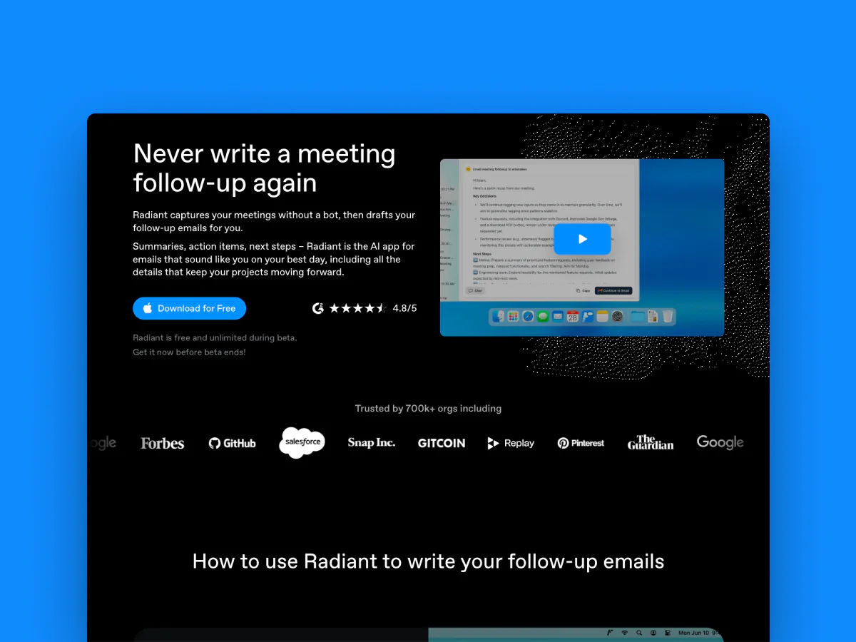
The Email follow-ups Radiant landing page: a 'Never write a meeting follow-up again' hero next to a follow-up email draft, with a Download for Free CTA.

Over a 3-month period

This page focused on post-meeting email follow-ups and achieved an 11% conversion rate.

Together, the 3 A/B test landing pages drove 97% of the downloads.

Beyond the core site

Alongside the core website build, the number of pages and visuals grew, and my work extended to 8 different areas.

At launch, paid ads sent visitors to Radiant's homepage, then to campaign-specific A/B landing pages.

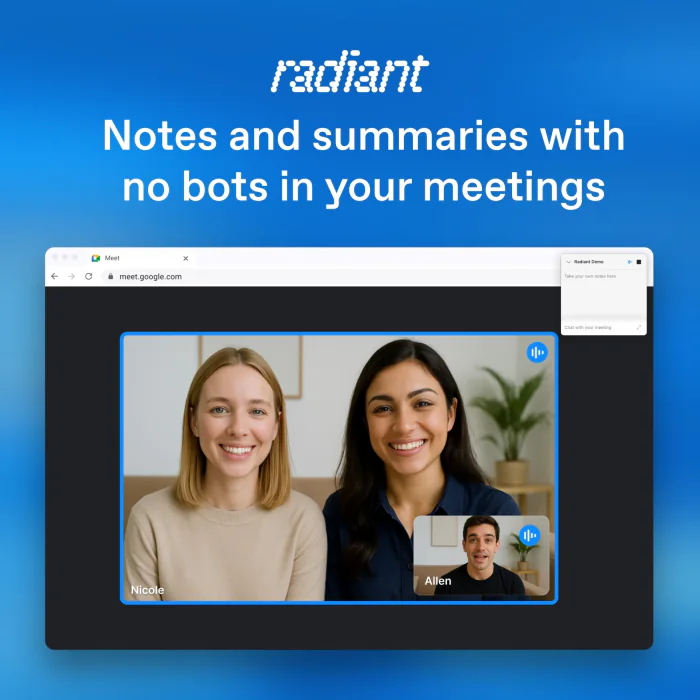
I designed static ads for 6 channels and 4 aspect ratios on a tight turnaround, and another teammate handled dynamic ads.

1:1 ad campaign examples for single-post placements
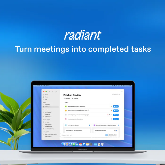
Square Google ad: Turn meetings into completed tasks, showing the Radiant app on a MacBook Air.

A few Google Ads banner campaign examples
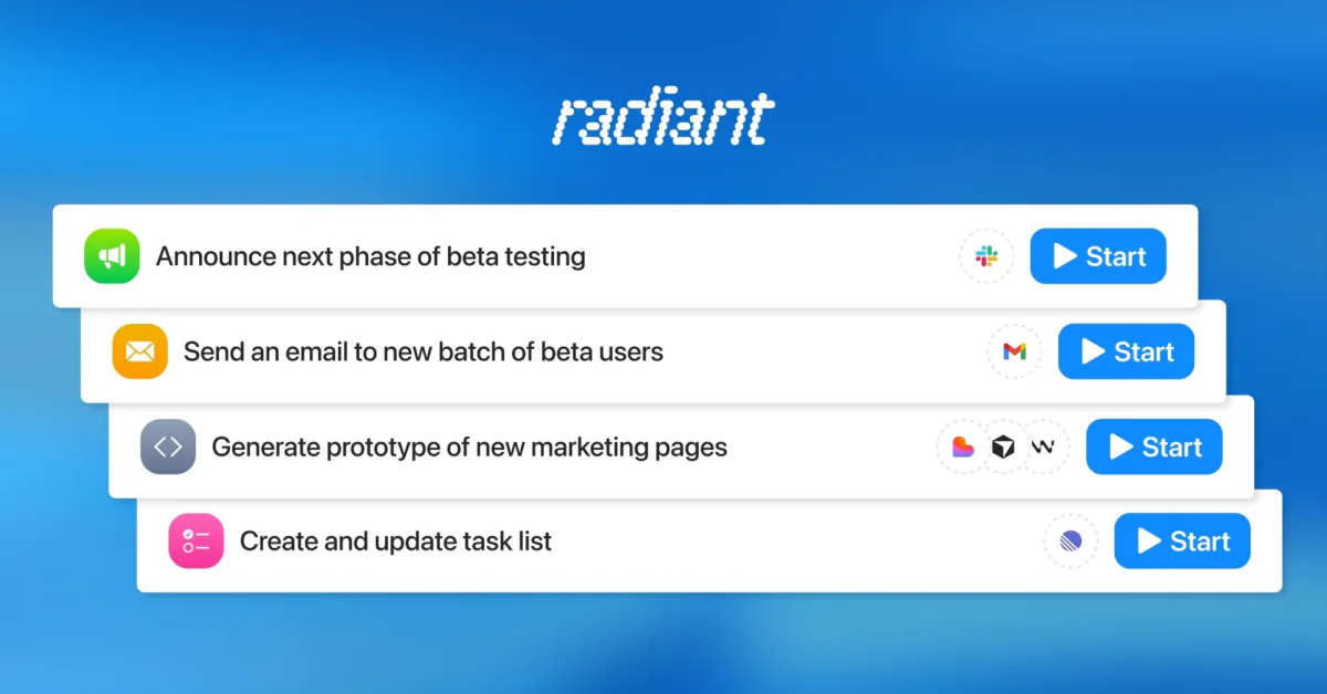
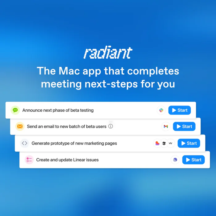
Google ad showing stacked Radiant task cards: announce beta testing, email beta users, generate prototypes, update tasks.

As Radiant evolved, so did the number of visuals.

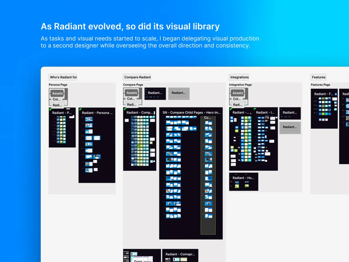
As tasks and visual needs started to grow, I began delegating visual production to a 2nd designer while overseeing the overall direction and consistency. Thus, a Figma library was created.

The Radiant Figma library organized into pages: Who's Radiant for, Compare Radiant, Integrations, and Features, each with assets, collections, and page-ready components.

A few visual examples

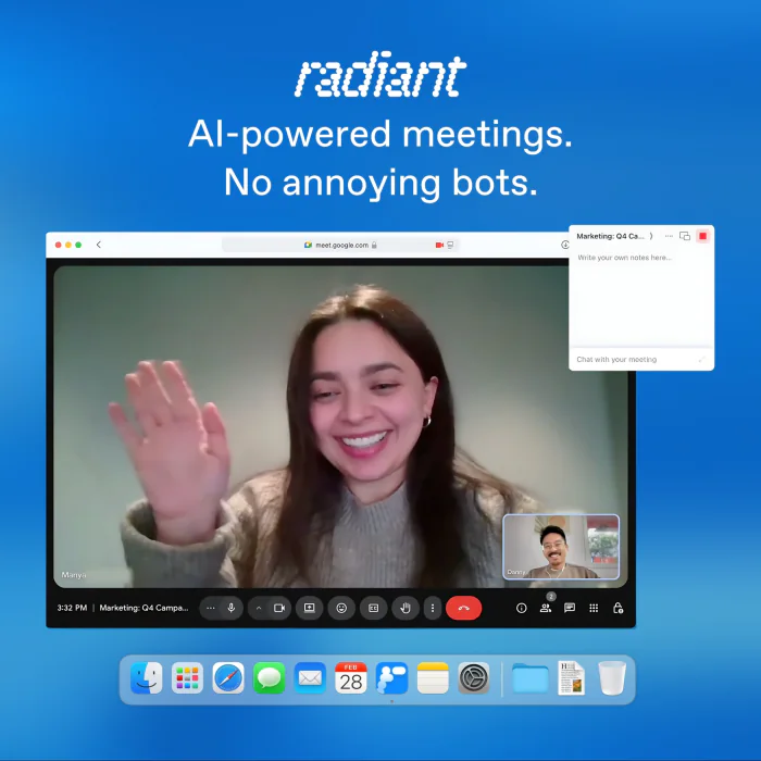
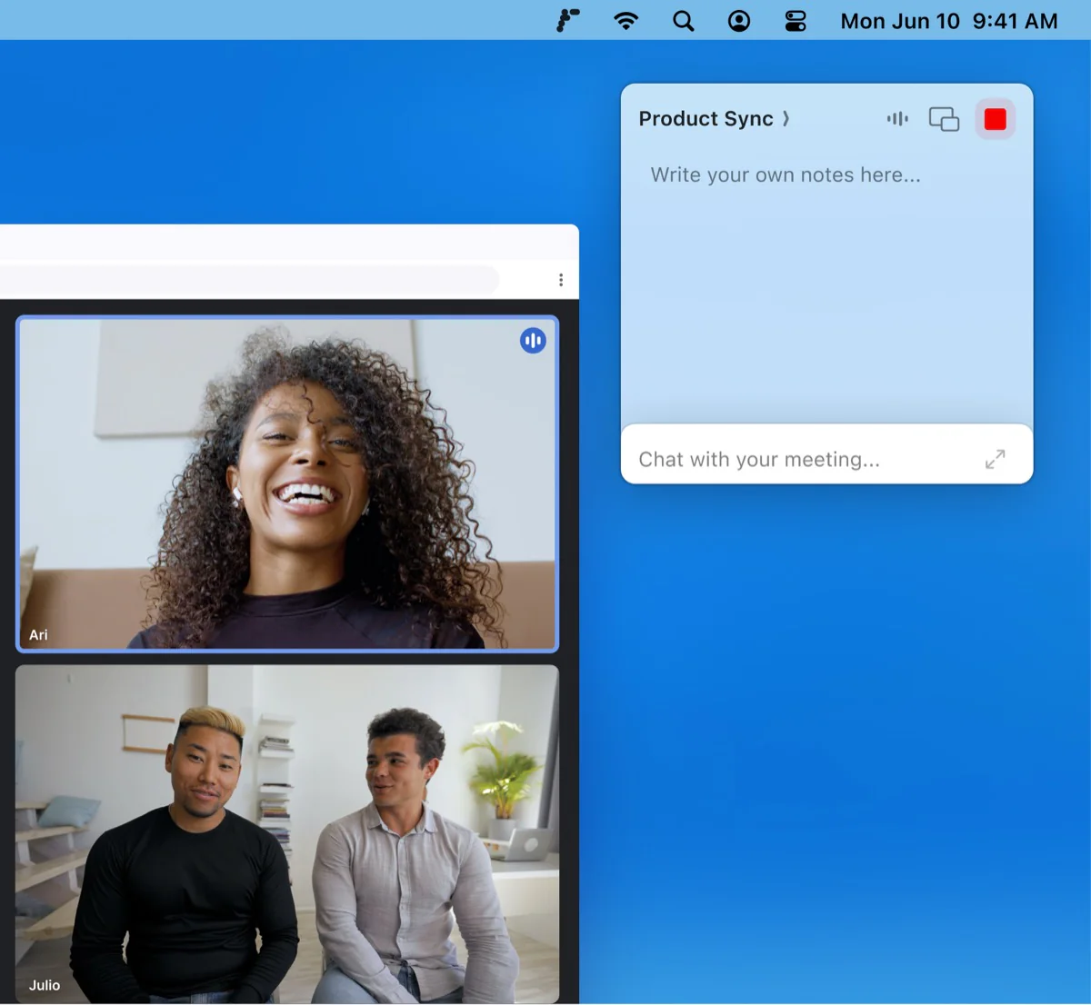
A video call with the floating Radiant notes widget recording a 'Product Sync' meeting.

Radiant's homepage also featured an animated Mac dock. It showed Radiant joining a user's tool stack, and its icon doubled as a 1-click download trigger.

I rebuilt the product updates page, so Radiant's email newsletter can be connected to it. CX could copy a link to any update and send customers the one relevant to a specific app issue.

The integration pages were created to explain how each tool works with Radiant, covering features, FAQs, and setup steps.

Take a look below at the hub that listed all tools, and the Lovable page.

The comparison pages were created to show why Radiant was a better choice than competing products.

A dynamic feature checklist and a draggable comparison slider let visitors see how Radiant and each competitor differed.

The use case pages were created to show how Radiant could improve work for agency teams, project managers, and freelancers.

Take a look below at how the parent and child pages look.

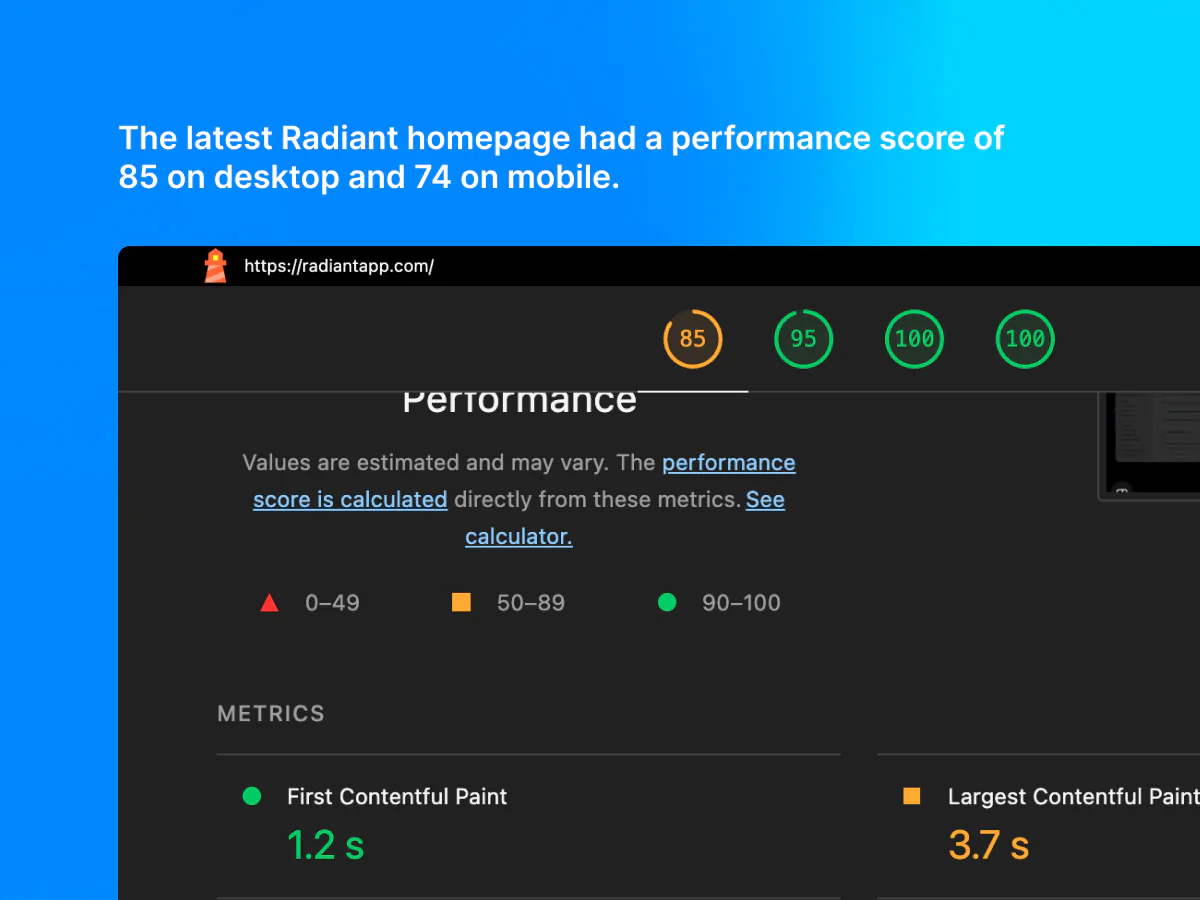
Rapid product and page updates outpaced site optimization, leaving Lighthouse performance scores at 32 on mobile and 51 on desktop.

I optimized components, layout, image formats, and video hosting, and reduced excess animations. The homepage and other pages improved substantially.

After the performance optimizations, Radiant's conversion rate rose by 6% within 2 weeks.

Lighthouse report for the Radiant homepage showing a desktop score of 85 for performance, 95 for accessibility, and 100 for both best practices and SEO.

Impacts

Radiant's strongest results reflected the team's work across both the website and product.

Lighthouse score improved from 51 to 85

Lighthouse rose from 51 to 85 on desktop and 32 to 74 on mobile. The conversion rate rose 6% within 2 weeks of the performance optimizations.

01 / 05

When the product moved on

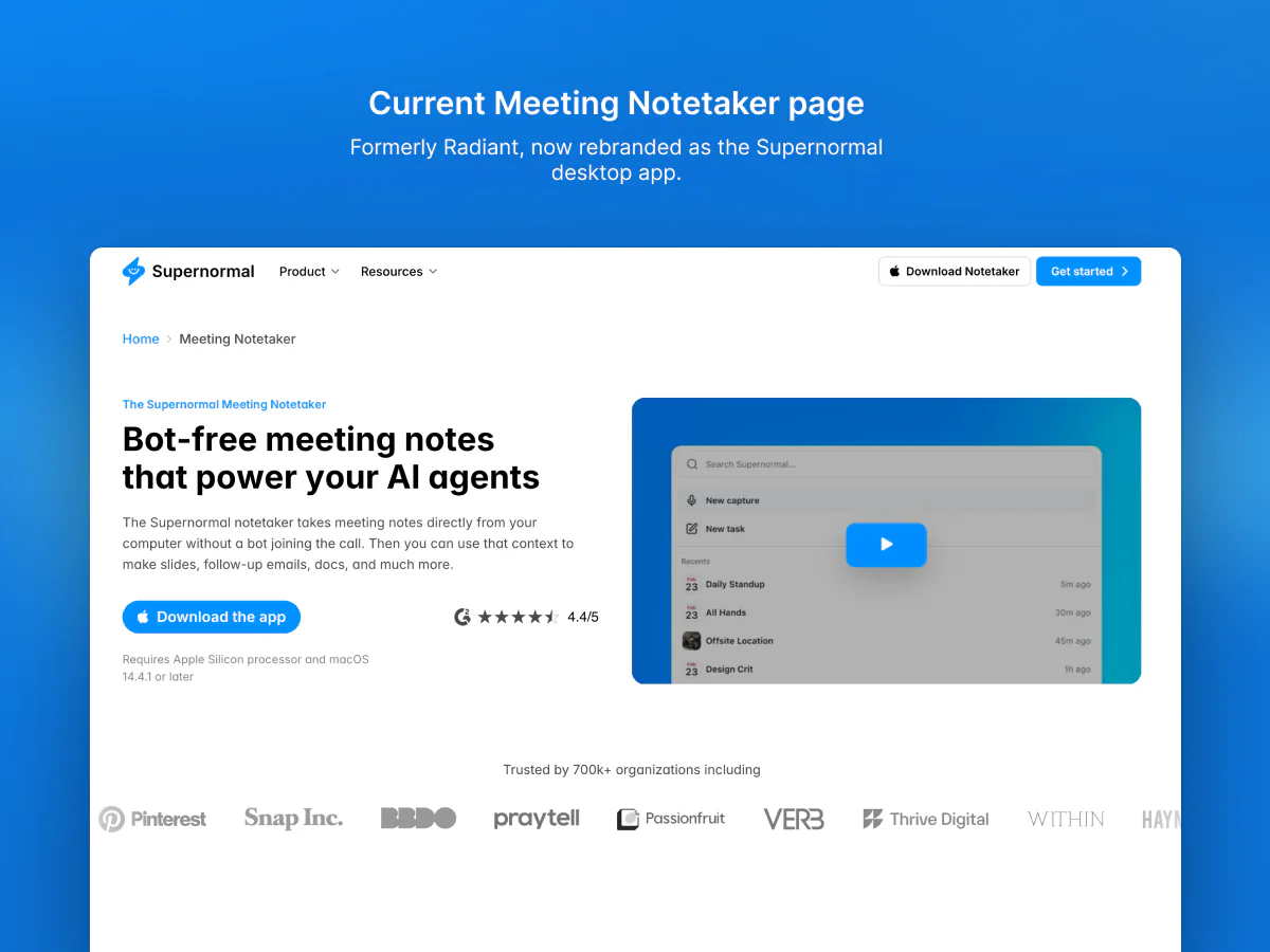
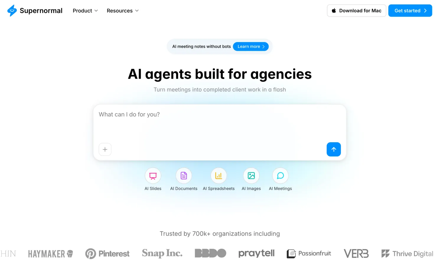
Radiant became Supernormal's free desktop app as the product shifted toward AI Agents.

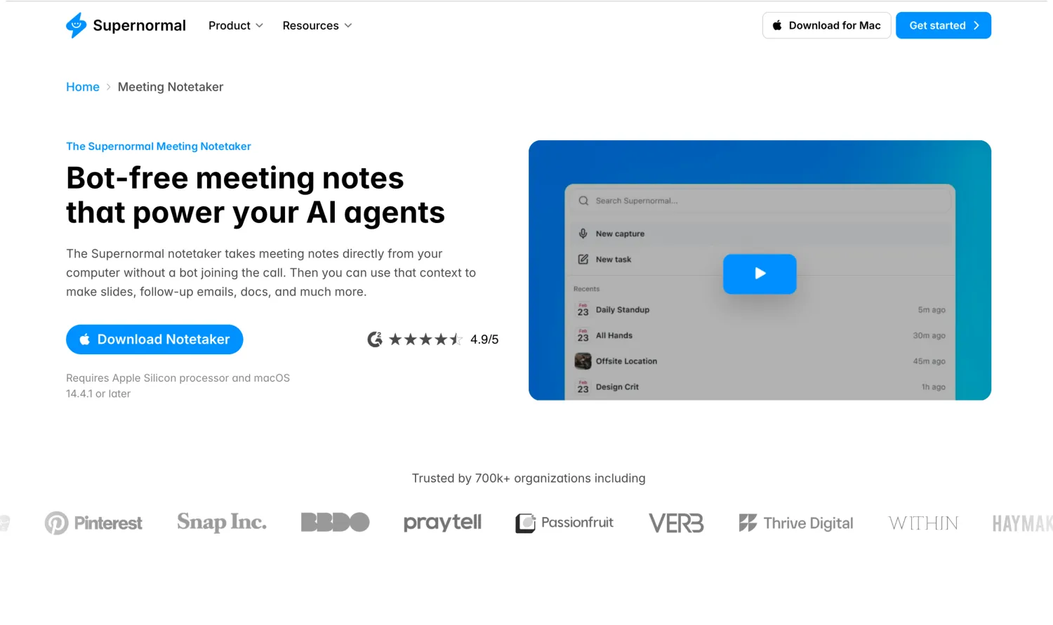
The current Supernormal Meeting Notetaker page, formerly Radiant, now rebranded as the Supernormal desktop app.

Follow the complete journey below:

  1. Radiant launched as a standalone notetaker on Framer while the original Supernormal website stayed live on Webflow, so existing users could be brought over gradually.

    Desktop app notetakerFramerWebflow
  2. As Supernormal shifted toward AI Agents, Radiant became its free desktop notetaker. It captured meetings while the Supernormal web app became the AI Agents workspace for next steps.

    Desktop app notetakerAI AgentsOne Framer website
  3. The Supernormal Webflow site and the Radiant Framer site were joined into 1 Framer system for a better experience.

    Site migrationCMS collectionsFramer

Radiant's story continues with Supernormal

See how the desktop app now feeds meetings into Supernormal's AI Agents.

Continue to Supernormal

Reflections

Working on Radiant helped me understand the importance of teamwork and delegation more than ever, so here are my top 3 reflections:

01

Performance over animation

Website performance matters more than a cool animation. On mobile, heavy animations can slow the site down and increase the bounce rate.

02

Know when to delegate

As the workload grew, it became just as important to ask for support and delegate.

03

Pages before design

A website can grow faster than its design. Thus, the priority in this project was to ship pages first and refine the design later on.

Explore more case studies

Take a look at the other projects I worked on so far.

Want to work
together?

Tell me about your project, and I’ll get back to you as soon as possible.

Explore more of my experience and what made me the designer I am today.